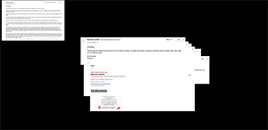
I am following this idea due to the tedious process I have gone through in trying to make a successful site for the midterm screensaver project.
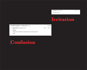
As for the site’s direction, I chose to display the first five screenshots of email communication that have been made during this process. The screenshots are staggered on the screen in the order I received them with the opacity of each lowering to convey how this process has been tiring throughout each step I had to take. The screenshots are timed to fadeout from the last correspond ace to first.
I set the background to show fire burning to convey how much I wish I could erase the entire process. Also, words are embedded in the site and positioned next to each email to show the viewer how I felt when I received each email.

